Social Design Collaborative
An architectural practice focused on Housing Rights, Social Justice, and Inclusive Design
2.7x growth in audience size
Duration: 1 year, 2020
Key Contributions
Logo Design
Visual Design System
Branding Guidelines
Creative Assets
Website Content
Graphic Design

Backstory
In 2019, founder Swati Janu approached me with the vision of transforming her solo practice into a full-fledged studio. Over lunch one afternoon, we sketched a handful of logo ideas in her Moleskine notebook. Those simple doodles grew into a comprehensive brand identity that has since attracted funders, supporters, and passionate talent, fueling her mission to create accessible housing and social services in low-income communities.

“A community-driven design, art, and architectural practice working to create inclusion in the built environment through collaborative projects.”
A Design Lab of Ideas
From day one, SDC has been about people, both the studio team and the communities it works with. It’s a hands-on space where ideas are sketched on the ground and brought to life as built environments that support people’s rights.

The logo highlights “Design Lab,” reinforcing the studio’s collaborative, people-first approach. True to its name, it’s a space where all ideas, whether scrappy or refined, are welcomed and given the chance to take shape.

Capturing SDC’s Essence
Inspired by the collaborative, hands-on spirit of SDC’s work, I designed a visual language for their website that reflects the essence of their practice. The goal was to create a system that not only captured their architectural and research projects but could also scale to showcase other facets of their work like toolkits, written publications, and community resources.
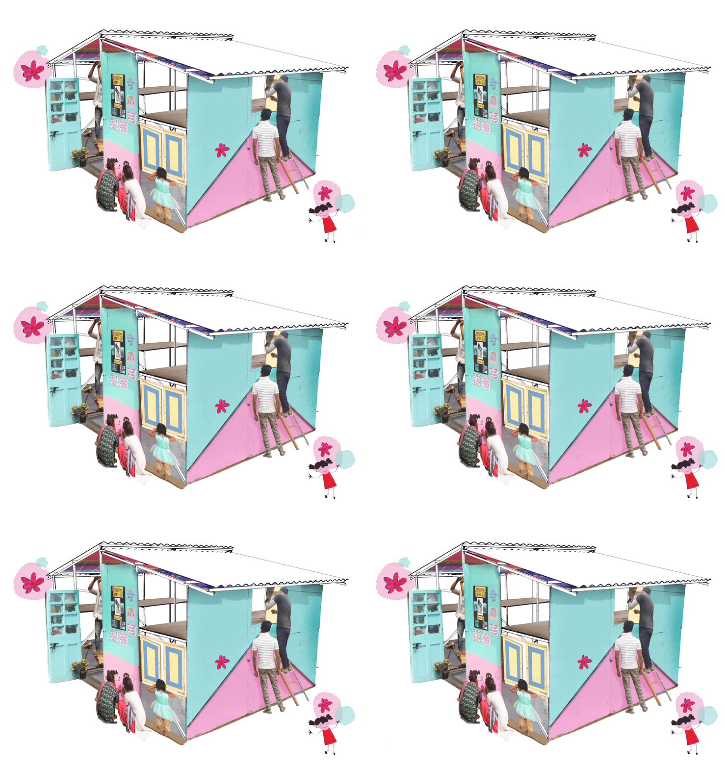



Building a visual library that reflects the wide range of projects SDC works on and the different scales at which it operates
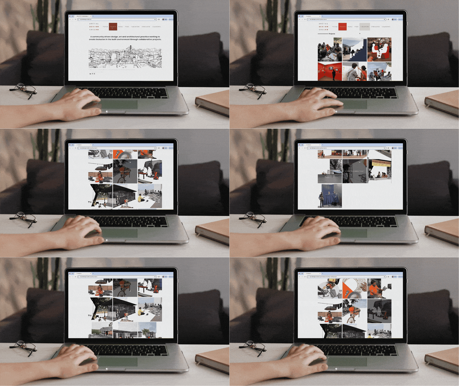
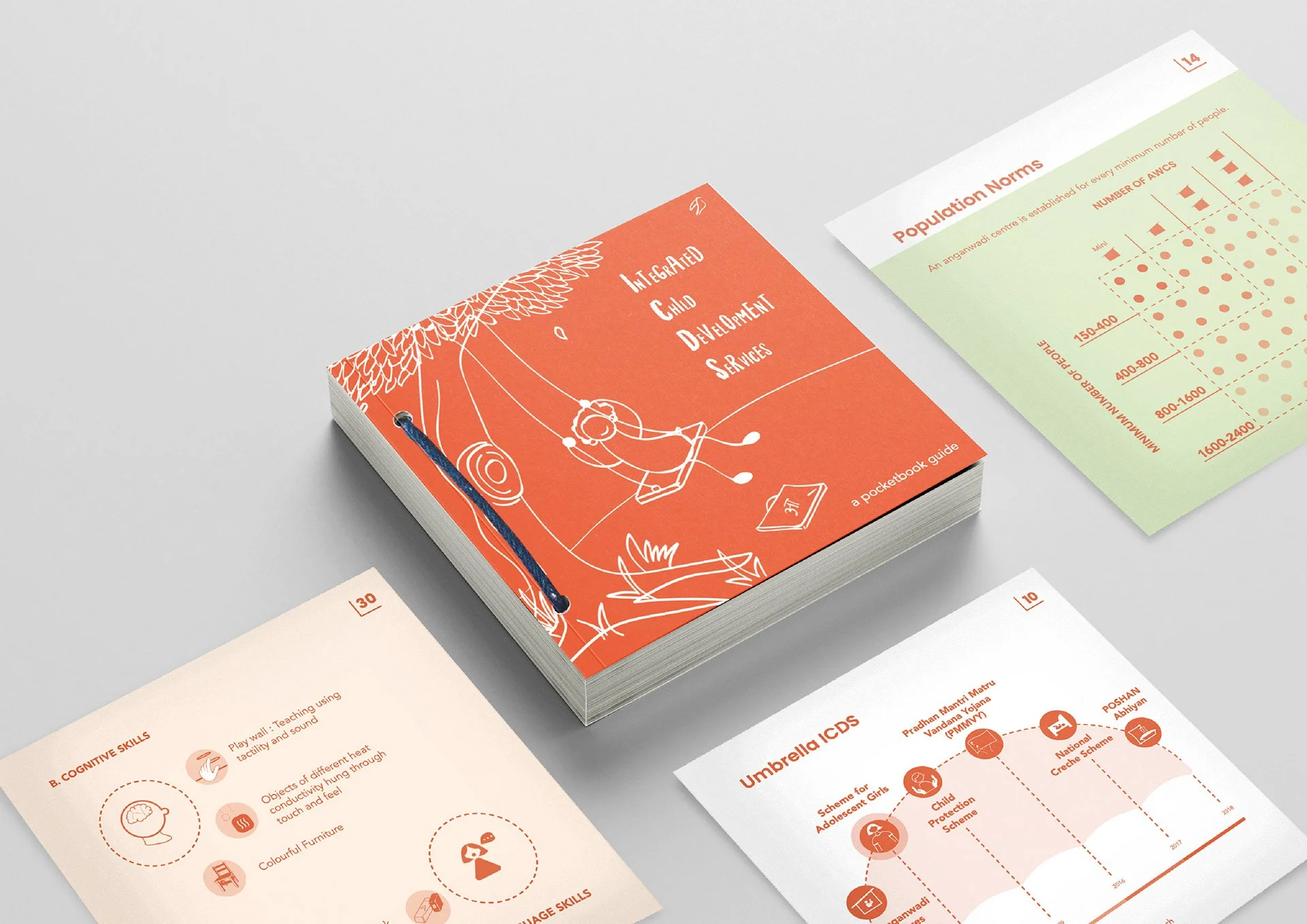
The collage style allowed for adapting the style for editorial applications in print - from magazine features to exhibitions and award shows!


Brand Suite
At the heart of the logo is the signature “Claykin” color, a bold, earthy tone that reflects the organization’s mission and the warmth embedded in its collaborative work. The surrounding neutrals and soft tones create a balanced palette that elevates Claykin, enabling a cohesive and flexible visual language. Poppins for headers and Avenir for body text keep the design clean and minimal.


SDC promotes women’s roles in architecture, challenging industry norms. I created two mascots “Lina” and “Bindu” who represent women as builders within the studio and the communities it serves. They appear throughout SDC’s resources and technical drawings alongside custom icons.
Ready to Share Your Story?
